

In this tutorial series, we’re exploring the core concepts and benefits of using GraphQL with Node.js and TypeScript architecture as we build a full-stack application together. So far, we’ve prepared our back-end to expose a GraphQL API – if you missed it, check out part one and two of the series.
In this final chapter, we’re going to build our front-end and implement the user-facing features of our app.
Helpful Resources for this Tutorial
In this tutorial series, we’ve covered the following parts:
Part I: Project Setup, Data Modelling Process, and Testing. In part one of this series, we looked at an overview of the demo project that we’re building, set up the local environment, modeled our data and started testing it.
Part II: Integrating GraphQL with PostGraphile. In part two, we dove into some of the core aspects of GraphQL and implemented and tested the back-end features of our project.
You can find the source code for this project at: https://github.com/ScalablePath/full-stack-gql-ts-node-tutorial
The final state of what we’re going to build in this part of the tutorial is available at: https://github.com/ScalablePath/full-stack-gql-ts-node-tutorial/tree/main/part-3/fe
Project Recap: Building a Product Catalogue and Inventory Management Application
As a quick recap, we’re building a simple product catalog and inventory management application that:
Previously, we implemented our application back-end, including data models defined asTypeORM entities with PostgreSQL as our database. We have also created our GraphQL API endpoints.
Next, we’ll focus on the front-end and integrate with our GraphQL API using Apollo Client and GraphQL codegen tools.Our goal is to build a sample full-stack app that showcases how to use and interact with a GraphQL API while having end-to-end type safety with TypeScript.
Here’s a sneak peek of what we are building:

Let’s get started!
Building a Front-end Client with React
First, we’ll bootstrap our front-end with React & TypeScript and configure some additional dependencies.
Project Setup
Let’s use the standard create-react-app to set up our project with React + TypeScript:
npx create-react-app graphql-fe --template typescript
We’ll also need include the following React Router for client-side routing:
npm install react-router-dom@6.3.0
Now let’s add Tailwind UI for effortless and consistent styling of our user interface. To use Tailwind, we need to first install it as a PostCSS plugin and then we can easily integrate with Webpack:
npx tailwindcss init -p
We should edit /src/index.css to replace it with the following statements:
@tailwind base;
@tailwind components;
@tailwind utilities;
And finally, to make use of the tailwind/forms library that we installed, replace the contents of the tailwind.config.js with this:
/** @type {import('tailwindcss').Config} */
module.exports = {
 content: [
   "./src/**/*.{js,jsx,ts,tsx}"
 ],
 theme: {
   extend: {},
 },
 plugins: [
   require('@tailwindcss/forms')
 ],
}
Next, we need to install Apollo Client to our app in order to make the integration with our back-end work.
Setting up Apollo Client with React
First, install Apollo Client and its dependencies:
npm install @apollo/client@3.6.9 graphql@16.5.0
npm install -save-dev @types/graphql@14.5.0
Now, let’s configure it inside our front-end by updating the \src\index.tsx:
import React from "react";
import ReactDOM from "react-dom/client";
import { ApolloClient, InMemoryCache, ApolloProvider } from "@apollo/client";

import "./index.css";
import App from "./App";
import ErrorBoundary from "./ErrorBoundary";

const client = new ApolloClient({
 uri: 'http://localhost:8090/graphql',
 cache: new InMemoryCache(),
});

const root = ReactDOM.createRoot(
 document.getElementById('root') as HTMLElement
);
root.render(
 <React.StrictMode>
   <ApolloProvider client={client}>
     <App />
   </ApolloProvider>
 </React.StrictMode>
);
This code assumes that the back-end is up and running on localhost on port 8090. Please change it as needed.
Configuring CORS
To prevent potential CORS issues when running our app in the browser and integrating with our GraphQL API, we need to add some additional configurations in our back-end.
To do this, let’s install these new packages in our back-end:
npm install cors@2.8.5

npm install --save-dev @types/cors@2.8.12
And edit the src\App.ts file to include the following lines:
import cors from 'cors'

 const app = express()
 app.use(express.json())
 app.use(cors()) // This needs to be added
 app.use(postgraphile(`postgresql://${pgUser}@localhost/catalog_db`, 'public', {
   watchPg: true,
   graphiql: true,
   enhanceGraphiql: true,
   appendPlugins: [RegisterTransactionPlugin],
 }))
Components Structure
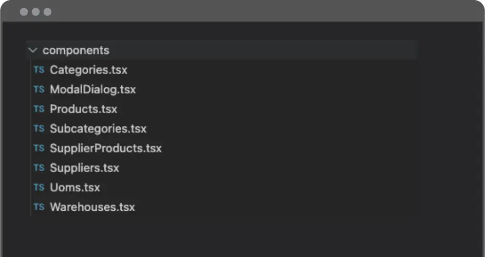
We’re all set up to wire our app routes and create our UI components. To do this, create a /src/components folder with these files inside it:
Let’s start with the /components/Categories.tsx. We’ll be using this component to serve as a template for the others, so some of the variable names will be more generic. You can think of this component as a simple boilerplate code for our demo purposes.
Our plan is to display a list of the existing records and the options to include new ones via a modal dialog. We should also be able to edit/delete those records. We’ll begin by importing the dependencies.
import { useState } from "react";
import { useQuery, useMutation, gql } from "@apollo/client";
import { ModalDialog } from "./ModalDialog";
We’re going to import a ModalDialog component (I’ll demonstrate how it’s implemented shortly).
Next, we need to define GraphQL queries and mutations by using gql literals.
const GET_ALL = gql`
 query GetCategories {
   allCategories {
     nodes {
       nodeId
       id
       description
     }
   }
 }
`;

const ADD_ENTITY = gql`
 mutation AddCategory($description: String!) {
   createCategory(input: { category: { description: $description } }) {
     category {
       nodeId
     }
   }
 }
`;

const DELETE_ENTITY = gql`
 mutation DeleteCategory($nodeId: ID!) {
   deleteCategory(input: { nodeId: $nodeId }) {
     deletedCategoryId
   }
 }
`;

const UPDATE_ENTITY = gql`
 mutation UpdateCategory($nodeId: ID!, $description: String!) {
   updateCategory(
     input: { nodeId: $nodeId, categoryPatch: { description: $description } }
   ) {
     category {
       nodeId
     }
   }
 }
`;
Next, declare types that mimic the GraphQL schema for this particular entity with:
interface AllEntity {
 allCategories: { nodes: Entity[] };
}

interface Entity {
 nodeId?: string;
 id?: number;
 description?: string;
}
Now we’re ready to define a variable to hold the name for this entity and create a React component called Categories.
const entityName = "Category";

export const Categories = (props: {}) => {}
Inside this React component, we’ll create some variables to manage the state using the useState hook. We’ll also use the useQuery and useMutation hooks to interact with the GraphQL API.
const [displayModal, setDisplayModal] = useState(false);
 const [entity, setEntity] = useState<Entity | undefined>(undefined);

 // Usage of the the Apollo Client's useQuery & useMutation to interact with
 // our GraphQL API
 const { loading, error, data } = useQuery<AllEntity>(GET_ALL);
 const [addEntity, { error: errorAdding }] = useMutation(ADD_ENTITY, {
   refetchQueries: [{ query: GET_ALL }]
 });
 const [deleteEntity, { error: errorDeleting }] = useMutation(DELETE_ENTITY, {
   refetchQueries: [{ query: GET_ALL }]
 });
 const [updateEntity, { error: errorUpdating }] = useMutation(UPDATE_ENTITY, {
   refetchQueries: [{ query: GET_ALL }]
 });
Don’t forget error handling! Here’s the boilerplate code we’ll be using to handle errors:
if (loading) return <span>Loading...</span>;
 if (error || errorAdding || errorDeleting || errorUpdating) {
   const message =
     error?.message ||
     errorAdding?.message ||
     errorDeleting?.message ||
     errorUpdating?.message;
   return <span>{`Error: ${message}`}</span>;
 }
 if (!data) return <span>No records found.</span>;
Let’s define a handleSave callbackfunction that will update the entity if it already exists or add a new one if it doesn’t:
const handleSave = () => {
   setDisplayModal(false);
   // Verifies if it's an update operation or ir it should create a new entity
   // based on having an existing nodeId
   if (entity?.nodeId) {
     updateEntity({
       variables: {
         nodeId: entity.nodeId,
         description: entity.description
       }
     });
   } else {
     addEntity({ variables: { description: entity?.description } });
   }
 };
We’re almost there! Now, it’s time to define a function to render the existing entity data into a simple table.
// Renders the existing entity data into a simple table
 const renderData = () => {
   return data.allCategories.nodes.map((entity: Entity) => {
     const { nodeId, id, description } = entity;
     return (
       <tr key={id}>
         <td className="px-6 py-4 whitespace-nowrap">
           <div className="text-sm text-gray-900">{id}</div>
         </td>
         <td className="px-6 py-4 whitespace-nowrap text-sm text-gray-500">
           {description}
         </td>
         <td className="px-6 py-4 whitespace-nowrap text-right text-sm font-medium">
           <button
             className="text-indigo-600 hover:text-indigo-900 pr-2"
             onClick={() => {
               setEntity(entity);
               setDisplayModal(true);
             }}>
             Edit
           </button>
           <button
             className="text-indigo-600 hover:text-indigo-900"
             onClick={() => deleteEntity({ variables: { nodeId } })}>
             Delete
           </button>
         </td>
       </tr>
     );
   });
 };
Finally, we can define the markup that we will be returning from our component.
return (
   <>
     {displayModal && (
       <ModalDialog
         title={`New ${entityName}`}
         onClose={() => setDisplayModal(false)}
         onSave={handleSave}
         enableSave={!!entity?.description}
         content={<EntityDetails entity={entity} setEntity={setEntity} />}
       />
     )}
     <div className="flex flex-col">
       <div className="px-6 py-4 whitespace-nowrap text-right text-sm font-medium">
         <button
           className="bg-blue-500 hover:bg-blue-700 text-white font-bold py-2 px-4 rounded"
           onClick={() => {
             setEntity(undefined);
             setDisplayModal(true);
           }}>
           New
         </button>
       </div>
       <div className="py-2 align-middle inline-block min-w-full">
         <div className="shadow overflow-hidden border-b border-gray-200">
           <table className="min-w-full divide-y divide-gray-200">
             <thead className="bg-gray-50">
               <tr>
                 <th
                   scope="col"
                   className="px-6 py-3 text-left text-xs font-medium text-gray-500 uppercase tracking-wider">
                   ID
                 </th>
                 <th
                   scope="col"
                   className="px-6 py-3 text-left text-xs font-medium text-gray-500 uppercase tracking-wider">
                   Description
                 </th>
                 <th scope="col" className="relative px-6 py-3">
                   <span className="sr-only">Actions</span>
                 </th>
               </tr>
             </thead>
             <tbody className="bg-white divide-y divide-gray-200">
               {renderData()}
             </tbody>
           </table>
         </div>
       </div>
     </div>
   </>
 );
Note that this markup is using a component called EntityDetails. The definition for this is:
// Component that implements a visual representation of the entity details,
// to be utilized inside of the ModalDialog instance.
const EntityDetails = (props: {
 entity: Entity | undefined;
 setEntity: React.Dispatch<React.SetStateAction<Entity | undefined>>;
}) => {
 const { entity, setEntity } = props;
 return (
   <>
     <div className="grid col-span-1 m-2 ">
       <label
         htmlFor="description"
         className="form-label inline-block mb-2 ml-1">
         Description
       </label>
       <input
         type="text"
         onChange={(e) =>
           setEntity({ ...entity, description: e.target.value })
         }
         value={entity?.description || ""}
         className="form-control block w-full rounded-lg mb-5"
         id="description"
       />
     </div>
   </>
 );
};
Now, let’s take a look at some of the key concepts that we introduced in this file.
Key Concepts
useQuery & useMutation
These hooks allow us to integrate with GraphQL’s read and write operations. We can use these Apollo Client hooks to track the loading/error states and interact with the responses whenever we’re querying or mutating an entity. You can find more details in Apollo GraphQL Documentation Queries and Mutations in Apollo Client.
gql
The gql construct makes use of a tagged template. It helps to write our GraphQL queries and mutations using a templated string.
Caching
There are many ways to tackle data caching in Apollo Client. It has a built-in robust caching mechanism that helps manage cached data. However, for the sake of simplicity, we are using data refetching instead of relying on a caching strategy. This is accomplished by specifying the refetechQueries parameter, as seen here:
const [addEntity, { error: errorAdding }] = useMutation(ADD_ENTITY, {
   refetchQueries: [{ query: GET_ALL }]
 });
 const [deleteEntity, { error: errorDeleting }] = useMutation(DELETE_ENTITY, {
   refetchQueries: [{ query: GET_ALL }]
 });
 const [updateEntity, { error: errorUpdating }] = useMutation(UPDATE_ENTITY, {
   refetchQueries: [{ query: GET_ALL }]
 });
The refetchQueries options instructs Apollo Client to refetch the given query (GET_ALL in our case) whenever a successful mutation is executed.
It’s out of the scope of this article to dive into the available cache policies, custom cache updates and optimistic strategies. But if you’re interested in learning more about these topics, you can find more information here.
Simple Validation
It’s worth noting that our validation mechanism is very basic. In our modal, we are enabling the save option when the required fields are filled, as seen here:
 <ModalDialog
         title={`New ${entityName}`}
         onClose={() => setDisplayModal(false)}
         onSave={handleSave}
         enableSave={!!entity?.description}
         content={<EntityDetails entity={entity} setEntity={setEntity} />}
       />
For this particular example, we’re setting the enableSave prop to true only if the entity description is filled.
A more sophisticated validation could be relying on form validation tools like Formik.
Great. We’ve now defined how to integrate the front-end with our GraphQL API, and you can find the source code for the other components below. It’s worth noting that since we are using /components/Categories.tsx as a template, these new components may not have any major difference, except for the visual changes regarding the field names displayed in the UI for each entity.
Source Code for All Other Components
We won’t include the source code for the other components in this tutorial, but you can find them in their final state inside the Github repo! Here are the links for each:
ModalDialog
This is how the shared ModalDialog component is implemented: /components/ModalDialog.tsx
export const ModalDialog = (props: {
 title: string;
 content: JSX.Element;
 enableSave: boolean;
 onClose: () => void;
 onSave: () => void;
}) => {
 const { title, content, enableSave, onClose, onSave } = props;

 return (
   <div className="fixed w-full h-full top-0 left-0 flex items-center justify-center">
     <div className="relative p-4 w-full max-w-2xl h-full sm:h-auto">
       <div className="relative bg-white rounded-lg shadow">
         <div className="flex justify-between items-start p-4 rounded-t border-b">
           <h3 className="text-xl font-semibold">{title}</h3>
           <button
             type="button"
             className="text-gray-400 bg-transparent rounded-lg text-sm p-1.5 ml-auto inline-flex items-center hover:bg-gray-600 hover:text-white"
             onClick={onClose}>
             <svg
               aria-hidden="true"
               className="w-5 h-5"
               fill="currentColor"
               viewBox="0 0 20 20"
               xmlns="http://www.w3.org/2000/svg">
               <path
                 fillRule="evenodd"
                 d="M4.293 4.293a1 1 0 011.414 0L10 8.586l4.293-4.293a1 1 0 111.414 1.414L11.414 10l4.293 4.293a1 1 0 01-1.414 1.414L10 11.414l-4.293 4.293a1 1 0 01-1.414-1.414L8.586 10 4.293 5.707a1 1 0 010-1.414z"
                 clipRule="evenodd"></path>
             </svg>
             <span className="sr-only">Close modal</span>
           </button>
         </div>
         {content}
         <div className="flex items-center justify-end p-3 space-x-2 rounded-b border-t border-gray-200 text-right">
           <button
             disabled={!enableSave}
             className="bg-blue-500 hover:bg-blue-700 text-white font-bold py-2 px-4 rounded disabled:opacity-50"
             onClick={onSave}>
             Save
           </button>
         </div>
       </div>
     </div>
   </div>
 );
};
We’ll update the App.tsx file to look like this:
import { BrowserRouter, Routes, Route } from "react-router-dom";

import { Dashboard } from "./Dashboard";
import { Categories } from "./components/Categories";
import { Subcategories } from "./components/Subcategories";
import { Suppliers } from "./components/Suppliers";
import { Uoms } from "./components/Uoms";
import { Warehouses } from "./components/Warehouses";
import { Products } from "./components/Products";
import { SupplierProducts } from "./components/SupplierProducts";
import { Transactions } from "./components/Transactions";

function App() {
 return (
   <BrowserRouter>
     <Routes>
       <Route path="/" element={<Dashboard />} />
       <Route path="/categories" element={<Categories />} />
       <Route path="/subcategories" element={<Subcategories />} />
       <Route path="/suppliers" element={<Suppliers />} />
       <Route path="/uoms" element={<Uoms />} />
       <Route path="/warehouses" element={<Warehouses />} />
       <Route path="/products" element={<Products />} />
       <Route path="/supplier-products" element={<SupplierProducts />} />
     </Routes>
   </BrowserRouter>
 );
}

export default App;
With this, we’re defining the demo app routes.
In addition, let’s create a Dashboard.tsx in the root of our /src directory with the following content:
import { Link } from "react-router-dom";

export const Dashboard = () => {
 return (
   <div className="grid grid-cols-1 gap-4 m-5">
     <Link className="underline" to="/categories">
       Categories
     </Link>
     <Link className="underline" to="/subcategories">
       Subcategories
     </Link>
     <Link className="underline" to="/suppliers">
       Suppliers
     </Link>
     <Link className="underline" to="/uoms">
       Uoms
     </Link>
     <Link className="underline" to="/warehouses">
       Warehouses
     </Link>
     <Link className="underline" to="/products">
       Products
     </Link>
     <Link className="underline" to="/supplier-products">
       Supplier Products
     </Link>
   </div>
 );
};
Testing Our Demo Application
It’s time for us to give it a try. The UI is really simplistic and focused on the CRUD operations. To start the app, just run this command:
npm run start
You should be able to access the demo app on http://localhost:3000. To make sure there aren’t any errors, you should see the main page with the following links:
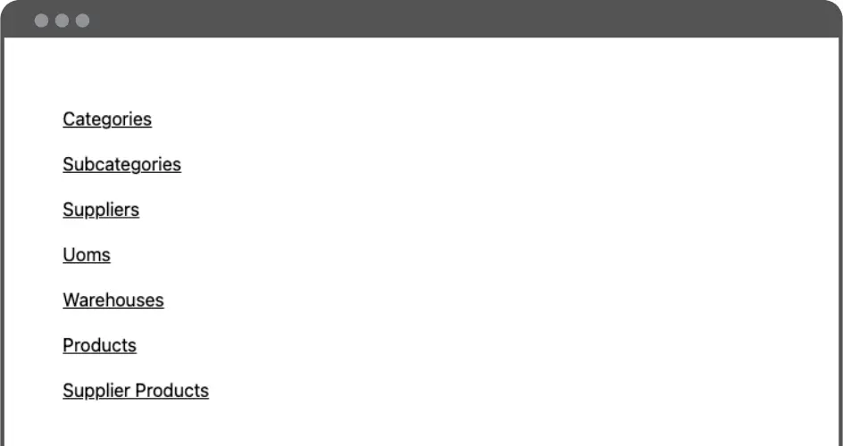
Each link redirects to a page containing a list of existing data and buttons for creating, editing and deleting records. Here’s the Categories page:

You should also check to see that the back-end is running. Otherwise, you might see errors like “Error: Failed to fetch“.
Clicking the New button launches the modal dialog:

Next Up: Improving Our Code with GraphQL Codegen
Our code is hard to maintain and scale at the moment because:
Let’s explore ways to improve our code.
Codegen
GraphQL Codegen can be helpful to better organize our code and it’s particularly useful with TypeScript, so we can have real type safety mechanisms in place.
We’ll use the GraphQL Code Generator tool and install it with the following commands:
npm install -D @graphql-codegen/cli@^2.13.6
npm install -D @graphql-codegen/fragment-matcher@3.3.1
npm install -D @graphql-codegen/import-types-preset@^2.2.3
npm install -D @graphql-codegen/introspection@2.2.1
npm install -D @graphql-codegen/typescript@2.7.3
npm install -D @graphql-codegen/typescript-operations@2.5.3
npm install -D @graphql-codegen/typescript-react-apollo@3.3.3
After installing these dependencies, let’s create a file under the root directory of our project (the parent directory of the /src folder) called codegen.yml with the following content:
overwrite: true
schema: "http://localhost:8090/graphql"
documents: "src/**/*.graphql"
generates:
 src/generated/graphql.tsx:
   plugins:
     - "typescript"
     - "typescript-react-apollo"
     - "fragment-matcher"
     - "typescript-operations"
   config:
     flattenGeneratedTypes: true
     skipTypename: true
 ./graphql.schema.json:
   plugins:
     - "introspection"
And inside our package.json file let’s include this script in the scripts section:
"generate": "graphql-codegen --config codegen.yml"
Now let’s create a file called Categories.graphql inside /src/components:
query GetCategories {
 allCategories {
   nodes {
     nodeId
     id
     description
   }
 }
}

mutation AddCategory($description: String!) {
 createCategory(input: { category: { description: $description } }) {
   category {
     nodeId
   }
 }
}

mutation DeleteCategory($nodeId: ID!) {
 deleteCategory(input: { nodeId: $nodeId }) {
   deletedCategoryId
 }
}

mutation UpdateCategory($nodeId: ID!, $description: String!) {
 updateCategory(
   input: { nodeId: $nodeId, categoryPatch: { description: $description } }
 ) {
   category {
     nodeId
   }
 }
}
This file essentially contains the mutations and queries extracted from the gql literals inside of the Categories.tsx file.
Then run our recently added command:
npm run generate
If everything runs as expected, you’ll notice that a src/generated/ directory is created and it contains the code that is generated by the codegen tools. From now on, every .graphql that we include in our /src/ folder will be included in our codegen generation process.
Now let’s start making use of these generated files! We’ll start by refactoring the Categories.tsx component. Since the other components share the same code structure, refactoring them should be a straightforward process. You just need to apply the same changes, including creating the .graphql file and using the correct imports.
In the /src/Categories.tsx file, add the following imports:
import {
 useGetCategoriesQuery,
 CategoryPatch,
 useAddCategoryMutation,
 useDeleteCategoryMutation,
 useUpdateCategoryMutation,
 GetCategoriesDocument
} from "../generated/graphql";
We also need to remove all of the existing gql usage, by removing the GET_ALL, ADD_ENTITY, DELETE_ENTITY and UPDATE_ENTITY declarations. Also, we don’t need to have the declaration of the AllEntity interface anymore. The Entity interface will be refactored to this:
interface Entity extends CategoryPatch {
 nodeId?: string;
}
Things start to get more interesting when we replace this code section:
const { loading, error, data } = useQuery<AllEntity>(GET_ALL);
 const [addEntity, { error: errorAdding }] = useMutation(ADD_ENTITY, {
   refetchQueries: [{ query: GET_ALL }]
 });
 const [deleteEntity, { error: errorDeleting }] = useMutation(DELETE_ENTITY, {
   refetchQueries: [{ query: GET_ALL }]
 });
 const [updateEntity, { error: errorUpdating }] = useMutation(UPDATE_ENTITY, {
   refetchQueries: [{ query: GET_ALL }]
 });
With this:
const { loading, error, data } = useGetCategoriesQuery();

 const [addEntity, { error: errorAdding }] = useAddCategoryMutation({
   refetchQueries: [{ query: GetCategoriesDocument }]
 });
 const [deleteEntity, { error: errorDeleting }] = useDeleteCategoryMutation({
   refetchQueries: [{ query: GetCategoriesDocument }]
 });
 const [updateEntity, { error: errorUpdating }] = useUpdateCategoryMutation({
   refetchQueries: [{ query: GetCategoriesDocument }]
 });
It may look like a subtle change, but now we can have type safety out of the box. Whenever we add/remove new fields, our type definition changes will be reflected in our source code at compile time.
Here’s the Categories.tsx with all of the changes that were introduced:
import { useState } from "react";
import { ModalDialog } from "./ModalDialog";
import {
 useGetCategoriesQuery,
 CategoryPatch,
 useAddCategoryMutation,
 useDeleteCategoryMutation,
 useUpdateCategoryMutation,
 GetCategoriesDocument
} from "../generated/graphql";

const entityName = "Category";

interface Entity extends CategoryPatch {
 nodeId?: string;
}

export const Categories = (props: {}) => {
 const [displayModal, setDisplayModal] = useState(false);
 const [entity, setEntity] = useState<Entity | undefined>(undefined);

 const { loading, error, data } = useGetCategoriesQuery();

 const [addEntity, { error: errorAdding }] = useAddCategoryMutation({
   refetchQueries: [{ query: GetCategoriesDocument }]
 });
 const [deleteEntity, { error: errorDeleting }] = useDeleteCategoryMutation({
   refetchQueries: [{ query: GetCategoriesDocument }]
 });
 const [updateEntity, { error: errorUpdating }] = useUpdateCategoryMutation({
   refetchQueries: [{ query: GetCategoriesDocument }]
 });

 // Boilerplate code for handling loading & error states
 if (loading) return <span>Loading...</span>;
 if (error || errorAdding || errorDeleting || errorUpdating) {
   const message =
     error?.message ||
     errorAdding?.message ||
     errorDeleting?.message ||
     errorUpdating?.message;
   return <span>{`Error: ${message}`}</span>;
 }
 if (!data?.allCategories) return <span>No records found.</span>;

 const handleSave = () => {
   setDisplayModal(false);
   // Verifies if it's an update operation or ir it should create a new entity
   // based on having an existing nodeId
   if (entity?.nodeId) {
     updateEntity({
       variables: {
         nodeId: entity.nodeId,
         description: entity.description!
       }
     });
   } else {
     addEntity({ variables: { description: entity?.description! } });
   }
 };

 // Renders the existing entity data into a simple table
 const renderData = () => {
   return data.allCategories!.nodes.map((entity) => {
     if (!entity) return null
     const { nodeId, id, description } = entity;
     return (
       <tr key={id}>
         <td className="px-6 py-4 whitespace-nowrap">
           <div className="text-sm text-gray-900">{id}</div>
         </td>
         <td className="px-6 py-4 whitespace-nowrap text-sm text-gray-500">
           {description}
         </td>
         <td className="px-6 py-4 whitespace-nowrap text-right text-sm font-medium">
           <button
             className="text-indigo-600 hover:text-indigo-900 pr-2"
             onClick={() => {
               setEntity(entity!);
               setDisplayModal(true);
             }}>
             Edit
           </button>
           <button
             className="text-indigo-600 hover:text-indigo-900"
             onClick={() => deleteEntity({ variables: { nodeId } })}>
             Delete
           </button>
         </td>
       </tr>
     );
   });
 };

 return (
   <>
     {displayModal && (
       <ModalDialog
         title={`New ${entityName}`}
         onClose={() => setDisplayModal(false)}
         onSave={handleSave}
         enableSave={!!entity?.description}
         content={<EntityDetails entity={entity} setEntity={setEntity} />}
       />
     )}
     <div className="flex flex-col">
       <div className="px-6 py-4 whitespace-nowrap text-right text-sm font-medium">
         <button
           className="bg-blue-500 hover:bg-blue-700 text-white font-bold py-2 px-4 rounded"
           onClick={() => {
             setEntity(undefined);
             setDisplayModal(true);
           }}>
           New
         </button>
       </div>
       <div className="py-2 align-middle inline-block min-w-full">
         <div className="shadow overflow-hidden border-b border-gray-200">
           <table className="min-w-full divide-y divide-gray-200">
             <thead className="bg-gray-50">
               <tr>
                 <th
                   scope="col"
                   className="px-6 py-3 text-left text-xs font-medium text-gray-500 uppercase tracking-wider">
                   ID
                 </th>
                 <th
                   scope="col"
                   className="px-6 py-3 text-left text-xs font-medium text-gray-500 uppercase tracking-wider">
                   Description
                 </th>
                 <th scope="col" className="relative px-6 py-3">
                   <span className="sr-only">Actions</span>
                 </th>
               </tr>
             </thead>
             <tbody className="bg-white divide-y divide-gray-200">
               {renderData()}
             </tbody>
           </table>
         </div>
       </div>
     </div>
   </>
 );
};

// Component that implements a visual representation of the entity details,
// to be utilized inside of the ModalDialog instance.
const EntityDetails = (props: {
 entity: Entity | undefined;
 setEntity: React.Dispatch<React.SetStateAction<Entity | undefined>>;
}) => {
 const { entity, setEntity } = props;
 return (
   <>
     <div className="grid col-span-1 m-2 ">
       <label
         htmlFor="description"
         className="form-label inline-block mb-2 ml-1">
         Description
       </label>
       <input
         type="text"
         onChange={(e) =>
           setEntity({ ...entity, description: e.target.value })
         }
         value={entity?.description || ""}
         className="form-control block w-full rounded-lg mb-5"
         id="description"
       />
     </div>
   </>
 );
};
Whenever we define new custom GraphQL queries/mutations or update the existing ones, remember to run the generate script again so the codegen tool can update the definitions file.
It’s important to be aware that the codegen tool creates type definitions for the custom GraphQL definitions described in the .graphql files. But since it connects to our GraphQL schema definition in the back-end, it also supports all of the existing queries and mutations.
Error Handling with Error Boundaries in React
Oftentimes dealing with error handling is a tedious task. If we look at our existing code, we can see lots of repetitive code to manage error cases. One simple way to enhance this is to use Error Boundaries in React. It may serve as an escape with a fallback UI in case an error is not handled in a component.
The one that we are going to create next is a custom Error Boundary for our demo. The purpose of it is just to simply log the error in the console and display a message to the user.
Let’s create it in /src/ErrorBoundary.tsx:
import { Component } from "react";

export default class ErrorBoundary extends Component {
  constructor(props) {
    super(props);
    this.state = { hasError: false };
  }

  static getDerivedStateFromError(_error) {
    return { hasError: true };
  }

  componentDidCatch(error, errorInfo) {
    // Something went wrong, logs the error.
    console.log(`An unexpected error has happened: ${errorInfo}`, error);
  }

  render() {
    // Display an error message to the user when an error occurs.
    if (this.state.hasError) {
      return (
        <h1>Something went wrong! Please refresh the page and try again.</h1>
      );
    }

    return this.props.children;
  }
}
And import it on our src/index.tsx file:
import ErrorBoundary from "./ErrorBoundary"
And update this code section to make use of it:
<React.StrictMode>
   <ErrorBoundary>
     <ApolloProvider client={client}>
       <App />
     </ApolloProvider>
   </ErrorBoundary>
 </React.StrictMode>
Let’s create a simple custom Error class in src/NotFoundError.ts:
export class NotFoundError extends Error {
 constructor() {
   super("Could not retrieve entity information.");
 }
}
Finally, let’s adapt our Categories.tsx file by importing our recently created custom error NotFoundError:
import { NotFoundError } from "../NotFoundError";
And replacing this:
if (error || errorAdding || errorDeleting || errorUpdating) {
   const message =
     error?.message ||
     errorAdding?.message ||
     errorDeleting?.message ||
     errorUpdating?.message;
   return <span>{`Error: ${message}`}</span>;
 }
With this:
if (error || errorAdding || errorDeleting || errorUpdating) {
   throw new NotFoundError();
 }
Now, whenever we see an error when using our mutations/queries, we’re going to throw our custom error and it will be caught by our Error Boundary.
Additional Front-end features
We could showcase additional interesting features for our front-end, but to keep the project simple, we won’t cover them in this tutorial. As a quick overview of those features, we could include:
Implementing Transactions Component to Finalize the Full-stack App
Let’s add the last few missing features in our app: registering inventory transactions and displaying those records together with the warehouse stocks. We’re going to prepare the related queries/mutation for our new Transactions component that we’re going to create next
We’ll start by specifying our GraphQL queries and mutations in a file called /src/components/Transactions.graphql:
fragment StockData on WarehouseStock {
 quantity
 warehouseByWarehouseId {
   name
 }
 productByProductId {
   description
 }
}

fragment TransactionData on InventoryTransaction {
 id
 quantity
 date
 type
 productByProductId {
   description
 }
 warehouseByWarehouseId {
   name
 }
}

query GetWarehousesStocks {
 allWarehouseStocks {
   nodes {
     nodeId
     ...StockData
   }
 }
}

query GetInventoryTransactions {
 allInventoryTransactions(orderBy: DATE_ASC) {
   nodes {
     nodeId
     ...TransactionData
   }
 }
}

mutation RegisterTransaction($input: RegisterTransactionInput!) {
 registerTransaction(input: $input) {
   transactionId
 }
}
And we’ll also organize the hooks to support those operations for our codegen to generate the components for us.
You may have noticed that we created two fragment declarations: StockData & TransactionData. Consider GraphQL fragments as a data subset that can be used by multiple mutations and queries. A common practice is to avoid repeating GraphQL declarations for commonly used attributes of a given type. For an in-depth explanation of how this works, please refer to the official document about fragments.
Although we’re not sharing these fragments among different queries/mutations yet, we could use them in the future if needed.
Before we run the generate script, let’s also add some new queries to fetch the Products and Warehouses that we need for our new Transactions component. Technically, we could define those in the same .graphql file, but it would be maintainable to organize them by entity type.
With that, let’s create a /components/Products.graphql with this content:
query GetProducts {
 allProducts {
   nodes {
     nodeId
     id
     description
     uomByUomId {
       abbrev
     }
   }
 }
}
Let’s create /components/Warehouses.graphql with this:
query GetWarehouses {
 allWarehouses {
   nodes {
     nodeId
     id
     name
   }
 }
}
Let’s run the generate script to have code generation for our new GraphQL operations:
npm run generate
We now have everything to introduce the src/components/Transactions.tsx component. Once we wire this component, it should look like this:

You can find the implementation for Transactions in the Github repo: https://github.com/ScalablePath/full-stack-gql-ts-node-tutorial/blob/main/part-3/fe/src/components/Transactions.tsx
We need to register this new component in our Dashboard and routes. To do that, simply update the \src\App.tsx file by adding the following import:
import { Transactions } from "./components/Transactions";
And by adding the route for Transactions:
<Route path="/transactions" element={<Transactions />} />
In the \src\Dashboard.tsx, add the following link to the end:
<Link className="underline" to="/transactions">
       Transactions
     </Link>
Now, if you browse our dashboard route, you’ll see a new “Transactions” link. Feel free to play around with it!
总结和其他资源:构建GraphQLAPI
在本系列文章中,我们介绍了如何构建演示应用程序的后端和前端,以探索GraphQLAPI和客户端体系结构,其中包括:
虽然我们选择在后端使用PostGraphile,在前端使用代码生成工具,但这只是构建和使用GraphQL API的众多选项的一个组合。考虑到我们的演示应用程序的范围,为了保持简单,我们选择了这些工具来帮助我们的开发。
使用我们已经实现的体系结构,添加新属性或创建新实体就像在后端修改或创建TypeORM实体一样简单。一旦我们这样做,我们的更改将自动在API中公开。前端将需要通过codegen更新GraphQL模式,并且无需做任何额外的工作即可使用!
- 登录 发表评论