
在本教程中,我们将演示具有“全部展开”和“全部折叠”按钮的“角度”材质表,其中每一行可以分别展开和折叠。我们将使用Angular项目中的材质库来使用其MatTableModule API来构建数据表。
此Angular柱与Angular4兼容,直到最新版本,Angular-7、Angula尔·8、Angullar 9、Angula 10、Anguular 11、Angurar 12和Angulal 13
具有可扩展行的Material Datatable有助于以请求和查看方式表示数据。表格的每一行都显示一些重要的列详细信息,用户可以单击这些列详细信息以展开该行并显示更多详细信息。
使用Material Datatable,我们可以轻松地更改行和列结构,其中可以融合替换行,这将用于显示展开的视图数据。我们将了解如何添加动画效果以启用行的展开和折叠。
Material Datatables可以在HTML模板中以两种可能的方式实现:1)原生HTML表元素,包括table、tr、td或2)使用Display Flex,借助交替的Mat指令,包括Mat table、Mat row、Mat cell。我们将使用这两种方式演示展开折叠。
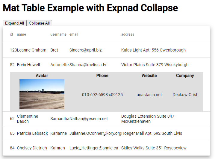
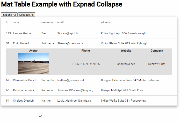
在表的顶部,两个按钮可以同时展开或折叠表的所有行。表的行将有一个可选的布尔属性展开,以知道哪一行处于展开状态。
如何在物料数据表行中添加展开折叠?
- 步骤1–创建角度应用程序
- 步骤2–安装材质库包
- 步骤3–导入MatTableModule API
- 步骤4–使用展开折叠创建物料数据表
- 步骤5–运行角度应用程序
步骤1–创建角度应用程序
在创建新的Angular应用程序之前,请确保已安装了最新版本的Angullar CLI工具:
npm install -g @angular/cli
安装ng-cli后,可以执行以下命令来创建新的angular项目:
ng new angular-mat-table-example
在应用程序文件夹目录中移动
cd angular-mat-table-example
在Visual Studio代码IDE中打开项目
code .
步骤2–安装材质库包
之后,只需执行以下命令即可安装材质库包。您将被问到一些配置问题,您可以更改它们或按enter键选择默认值:
ng add @angular/material

# ? Choose a prebuilt theme name, or "custom" for a custom theme: Indigo/Pink
# ? Set up global Angular Material typography styles? No
# ? Set up browser animations for Angular Material? Yes
步骤3–导入Mat Table模块API
在安装材料包时,您将能够通过导入所需的API模块来使用任何组件。在我们的教程中,我们将实现Datatable,因此我们将导入MatTableModule。
Open the app.module.ts file and update it as shown below:
import { NgModule } from '@angular/core';
import { BrowserModule } from '@angular/platform-browser';

import { AppComponent } from './app.component';
import { BrowserAnimationsModule } from '@angular/platform-browser/animations';
import { MatTableModule } from '@angular/material/table';

@NgModule({
  declarations: [
    AppComponent
  ],
  imports: [
    BrowserModule,
    BrowserAnimationsModule,
    MatTableModule // <-- Added Module
  ],
  providers: [],
  bootstrap: [AppComponent]
})
export class AppModule { }
步骤4–使用展开折叠创建物料数据表
现在,我们将创建具有可扩展行的Material Datatable。打开应用程序组件。html文件,并用以下代码更新:
<div class="wrapper">

  <h1>
    Mat Table Example with Expnad Collapse
  </h1>
  <button (click)="manageAllRows(true)">Expand All</button>
  <button (click)="manageAllRows(false)">Collpase All</button>

  <table mat-table [dataSource]="dataSource" multiTemplateDataRows class="mat-elevation-z8">
    <ng-container matColumnDef="{{column}}" *ngFor="let column of columnsToDisplay">
      <th mat-header-cell *matHeaderCellDef> {{column}} </th>
      <td mat-cell *matCellDef="let element"> {{element[column]}} </td>
    </ng-container>

    <!-- Expanded Content Column - The detail row is made up of this one column that spans across all columns -->
    <ng-container matColumnDef="expandedDetail">
      <td mat-cell *matCellDef="let element" [attr.colspan]="columnsToDisplay.length">
        <div class="example-element-detail" [@detailExpand]="element.expanded ? 'expanded' : 'collapsed'">
          <table class="detail-table">
            <tr>
              <th>Avatar</th>
              <th>Phone</th>
              <th>Website</th>
              <th>Company</th>
            </tr>
            <tr>
              <td><img src="https://picsum.photos/id/{{element.id}}/150/100" alt="thumbnail"></td>
              <td>{{element.phone}}</td>
              <td>{{element.website}}</td>
              <td>{{element.company}}</td>
            </tr>
          </table>
        </div>
      </td>
    </ng-container>

    <tr mat-header-row *matHeaderRowDef="columnsToDisplay"></tr>
    <tr mat-row *matRowDef="let element; columns: columnsToDisplay;" class="example-element-row"
      [class.example-expanded-row]="element.expanded" (click)="toggleRow(element)">
    </tr>
    <tr mat-row *matRowDef="let row; columns: ['expandedDetail']" class="example-detail-row"></tr>
  </table>

</div>
在表的顶部,我们有两个按钮来展开或折叠所有表行细节。列定义为expandedDetail的ng容器用作备用表行,该行将根据扩展的布尔值进行切换。动画状态用于设置展开和折叠行为的动画。
当用户手动或单击主展开按钮展开时,展开的表格行将显示一个内部表格以显示更多详细信息。您还可以在其中添加一个组件,该组件将从远程服务API调用加载动态数据。
此外,使用表数据和事件处理程序更新组件类,以折叠和展开行。打开应用程序组件。ts文件和更新,如下所示:
import { animate, state, style, transition, trigger } from '@angular/animations';
import { Component } from '@angular/core';

export interface User {
  id: number;
  name: string;
  username: string;
  email: string;
  address: string;
  phone: string;
  website: string;
  company: string;
  expanded: boolean;
}

const ELEMENT_DATA: User[] = [
  {
    "id": 123,
    "name": "Leanne Graham",
    "username": "Bret",
    "email": "Sincere@april.biz",
    "address": "Kulas Light Apt. 556 Gwenborough",
    "phone": "1-770-736-8031 x56442",
    "website": "hildegard.org",
    "company": "Romaguera-Crona",
    "expanded": false
  },
  {
    "id": 52,
    "name": "Ervin Howell",
    "username": "Antonette",
    "email": "Shanna@melissa.tv",
    "address": "Victor Plains Suite 879 Wisokyburgh",
    "phone": "010-692-6593 x09125",
    "website": "anastasia.net",
    "company": "Deckow-Crist",
    "expanded": false
  },
  {
    "id": 62,
    "name": "Clementine Bauch",
    "username": "Samantha",
    "email": "Nathan@yesenia.net",
    "address": "Douglas Extension Suite 847 McKenziehaven",
    "phone": "1-463-123-4447",
    "website": "ramiro.info",
    "company": "Romaguera-Jacobson",
    "expanded": false
  },
  {
    "id": 65,
    "name": "Patricia Lebsack",
    "username": "Karianne",
    "email": "Julianne.OConner@kory.org",
    "address": "Hoeger Mall Apt. 692 South Elvis",
    "phone": "493-170-9623 x156",
    "website": "kale.biz",
    "company": "Robel-Corkery",
    "expanded": false
  },
  {
    "id": 84,
    "name": "Chelsey Dietrich",
    "username": "Kamren",
    "email": "Lucio_Hettinger@annie.ca",
    "address": "Skiles Walks Suite 351 Roscoeview",
    "phone": "(254)954-1289",
    "website": "demarco.info",
    "company": "Keebler LLC",
    "expanded": false
  }
];


@Component({
  selector: 'app-root',
  templateUrl: './app.component.html',
  styleUrls: ['./app.component.css'],
  animations: [
    trigger('detailExpand', [
      state('collapsed', style({ height: '0px', minHeight: '0' })),
      state('expanded', style({ height: '*' })),
      transition('expanded <=> collapsed', animate('225ms cubic-bezier(0.4, 0.0, 0.2, 1)')),
    ]),
  ],
})
export class AppComponent {
  title = 'angular-mat-table-example';

  dataSource = ELEMENT_DATA;
  columnsToDisplay = ['id', 'name', 'username', 'email', 'address'];

  toggleRow(element: { expanded: boolean; }) {
    // Uncommnet to open only single row at once
    // ELEMENT_DATA.forEach(row => {
    //   row.expanded = false;
    // })
    element.expanded = !element.expanded
  }

  manageAllRows(flag: boolean) {
    ELEMENT_DATA.forEach(row => {
      row.expanded = flag;
    })
  }
}
要使可扩展行更符合功能和动画,请在app.component.CSS/scss文件中添加以下CSS样式:
.example-detail-row {
  height: 0;
}

.example-element-row td {
  border-bottom-width: 0;
}

.example-element-detail {
  overflow: hidden;
  display: flex;
}

.detail-table {
  background: #b7b7b773;
  text-align: center;
}
步骤5–运行角度应用程序
现在,我们都准备好用扩展折叠功能测试Material Datatable的实现。运行以下ng命令以部署Web服务器:
ng serve --open
它将在以下URL打开应用程序:
http://localhost:4200
在Datatable中使用Mat表
我们可以轻松地将NativeHTML表标记与<mat>进行交换,以实现基于flex的数据表,使用它我们可以轻松定制表样式。只需放置以下HTML模板和相应的CSS样式即可实现类似的展开-折叠动画:
<h1>
    Mat Table Directive Example with Expand Collapse
  </h1>

  <mat-table [dataSource]="dataSource" multiTemplateDataRows class="mat-elevation-z8">
    <ng-container matColumnDef="{{column}}" *ngFor="let column of columnsToDisplay">
      <mat-header-cell *matHeaderCellDef> {{column}} </mat-header-cell>
      <mat-cell *matCellDef="let element"> {{element[column]}} </mat-cell>
    </ng-container>

    <!-- Expanded Content Column - The detail row is made up of this one column that spans across all columns -->
    <ng-container matColumnDef="expandedDetail">
      <mat-cell *matCellDef="let element" [attr.colspan]="columnsToDisplay.length">
        <div class="example-element-detail" [@detailExpand]="element.expanded ? 'expanded' : 'collapsed'">
          <table class="detail-table">
            <tr>
              <th>Avatar</th>
              <th>Phone</th>
              <th>Website</th>
              <th>Company</th>
            </tr>
            <tr>
              <td><img src="https://picsum.photos/id/{{element.id}}/150/100" alt="thumbnail"></td>
              <td>{{element.phone}}</td>
              <td>{{element.website}}</td>
              <td>{{element.company}}</td>
            </tr>
          </table>
        </div>
      </mat-cell>
    </ng-container>

    <mat-header-row *matHeaderRowDef="columnsToDisplay"></mat-header-row>
    <mat-row *matRowDef="let element; columns: columnsToDisplay;" class="example-element-row"
      [class.example-expanded-row]="element.expanded" (click)="toggleRow(element)">
    </mat-row>
    <mat-row *matRowDef="let row; columns: ['expandedDetail']" class="example-detail-row"></mat-row>
  </mat-table>
此外,替换以下CSS以控制显示灵活布局。
.example-detail-row {
  height: 0;
  min-height: auto;
  display: inline-block;
  width: 100%;
}

.example-element-row td {
  border-bottom-width: 0;
}

.example-element-detail {
  overflow: hidden;
  display: flex;
  width: 100%;
}

.detail-table {
  background: #b7b7b773;
  text-align: center;
}
结论
我们已经完成了具有扩展折叠功能的物料数据表的实现,其中用户可以同时打开多行明细。您可以取消注释提供的代码,以便一次只打开一行。我们已经使用了table标签来创建数据表,在下一篇文章中,我们将讨论如何使用maerial中的mattable标签创建展开折叠特性。
- 登录 发表评论